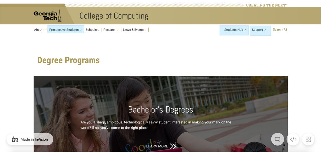
College of Computing Website Overhaul Aug 2019 - Dec 2019
Introduction This
project was a semester long project which consisted on preparing a set
of design recommendations for the future College of Computing website
based on the needs of the student population. We targeted both current
and prospective students during our research phase. While the project
was semester-long, involved a team of 5 people, and yielded a myriad of
documentation (there are 4 reports available if interested), I will make
an effort to condense the information into the most relevant to my
involvement in the project. My key roles were on Data Analysis and
User-based Evaluation.
Research Methods & Data Analysis We
used a variety research methods to address different aspects of the
redesign. We looked at Survey responses, Website Analytics, Heuristic
Evaluation, Card Sorting, and Stakeholder Interviews. We began our work
with the Survey which revealed interest rates, opinions, common issues,
and, topic of navigation per device.
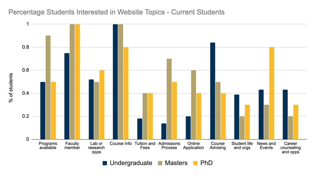
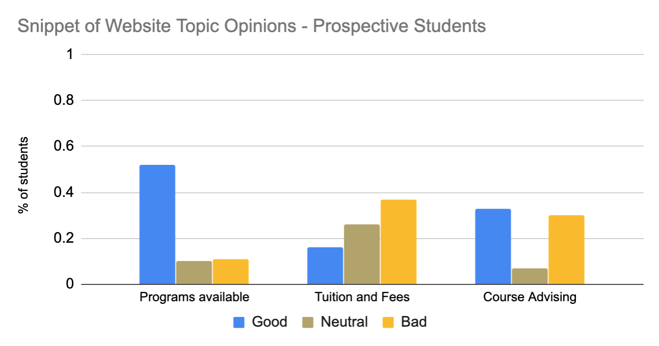
Below is a graph depicting
the percentage of students interested in topics found on the website.
The data was been normalized to account for differences in the sample
size of each of our populations (i.e. Undergraduate, Master, PhD).
We
also conducted a semi-closed Card Sorting activity with seven
participants across all three student groups. We pulled all the tabs in
the CoC homepage and created the cards with it. The main titles for the
drop-downs were printed larger and the participants were told the
smaller cards should fit into this larger categories. We call it a
semi-closed card sort because we allowed participants to trash cards
they found useless for the CoC website and to make up their own
categories if this made more sense to them.
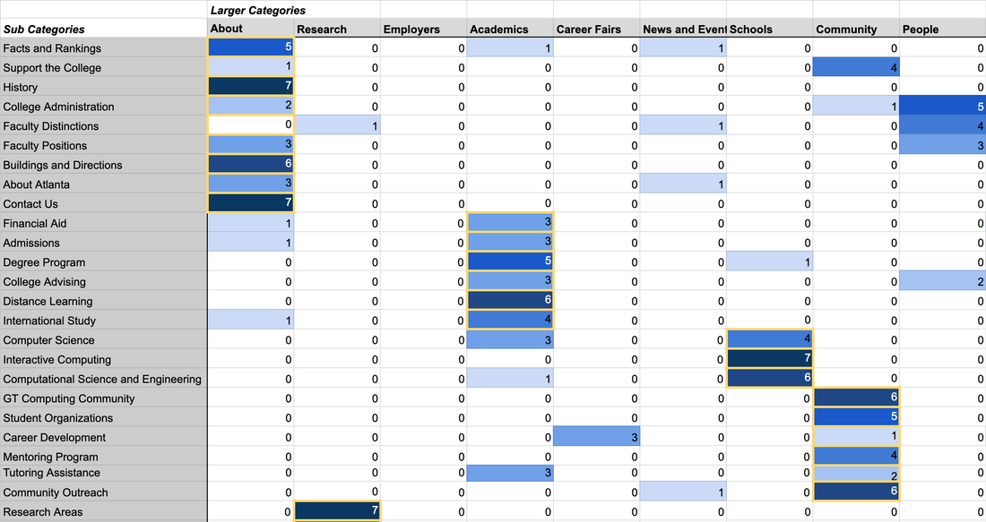
We
compiled all the participants' responses and created the above table. We
use a heat indicator (hue of blue) to quickly visualize on which
categories participants agreed most. The yellow outline on some
categories represents what the current tabs under each of the drop-downs
are. In summary, if the color inside the yellow square is dark blue
those categories have been accurately placed on the website.
On
this activity we caught a glimpse of our population's mental model,
most of it was matched with what the website had already in place, but
there were some categories that were completely out of place. The
activity also revealed many nomenclature issues with labels that didn't
accurately portray the content of the site. This data was used to
document our decision of building a site map centered around the
specific user needs rather than broad topics.
Design Evaluation To
evaluate our design we decided to construct two full paths aimed to
target prospective and current students needs. The two paths we decided
to construct were chosen from the research findings in the prior phases,
mainly from the survey results and the qualitative feedback from the
card sort activity.
A|B Testing We
used a platform called Usertesting.com. It allowed us to set up a
scenario and tasks for a variety of participants to follow. The platform
allows you to set up different screening conditions to filter who can
do your test according to some variables (i.e. salary, language, status,
etc). For our testing we specified we wanted participants between 18
and 30 in order to find people who were students now, or had been not
too long ago. We did this so all our participants were familiar with how
a college website operates, if wouldn't help if our participants
attended college when there was no internet.
We had 12
participants in total spanning across four groups of three participants
each. We tested the navigation on both Desktop and Mobile version of the
site, and with the legacy site and the new design. We set up 4 tasks
for the participants to try accomplish. These came from the earlier
results from the Survey.
We
picked topics were students opinions were distributed in different
forms. One where the opinions was negatively skewed, one positively
skewed, and one split down the middle. Doing this activity allowed us to
revalidate our earlier prior results on the research phase. There was
an additional task we included related to international students. During
a cognitive walkthrough session with an international student, she
pointed out that there was no place for an international student to find
information. We had seen none of this on the survey or earlier methods
so we decided to include a task to look for international student
relevant information in the evaluation.
The tasks we set up were
geared at highlighting the current and largest problems with the site to
see if our designs could make an improvement. To assess if this was
true, we looked at time-on-task metrics and at Likert Scale
information.
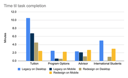
The time on
task confirmed what we saw in the beginning of the project, tuition
information was very hard to find. However this data should be
taken with a grain of salt, the legacy site contains many more pages and
content than the designed pathways. So it makes sense that the time on
task for the legacy is longer because the participants can get lost
through more pages. That's why we also looked at Likert scale
information.
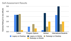
It was hard
to define a clear advantage on using the designed site compared to the
legacy. In some aspects it seemed better while in others it was worse.
This graph clearly shows that there is still improvement on the
positioning of information on the site.
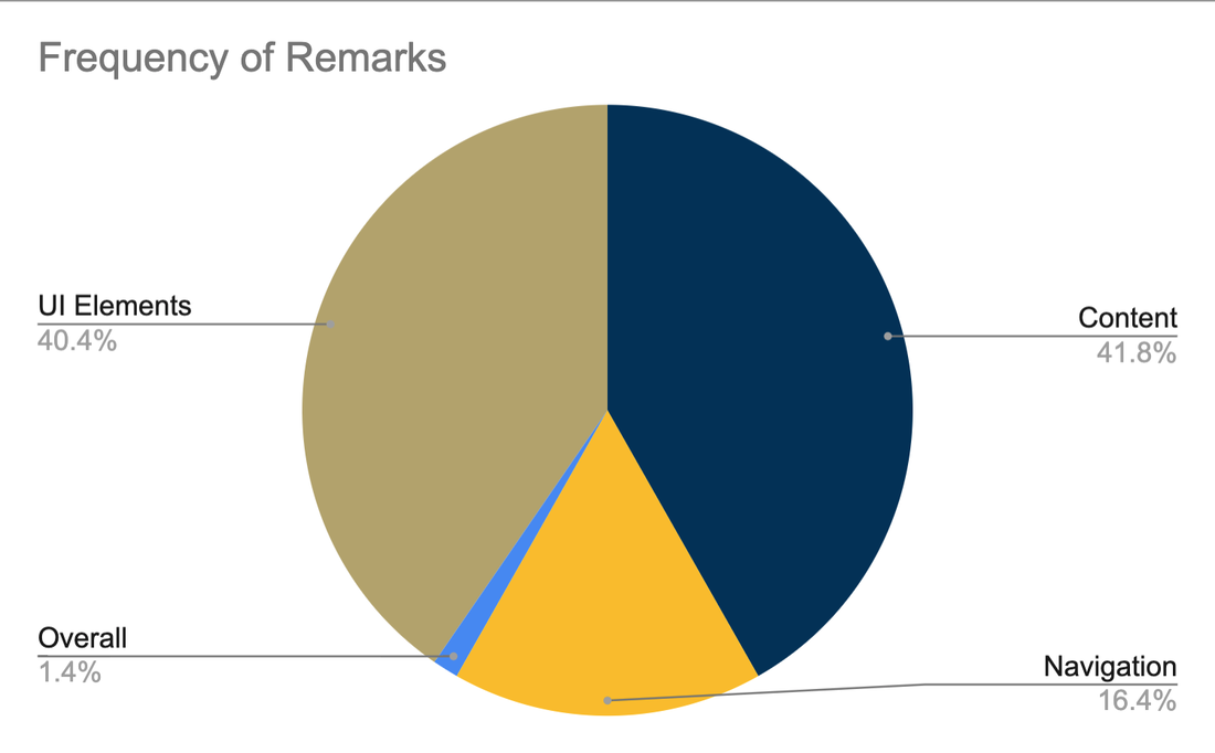
Heuristic Evaluation Qualitative Data Our
experts gave us valuable insights on what aspects of the site we could
use, the feedback was categorized into Navigation, Content, and UI
Elements.
Team Shihui Ruan Prabodh Sakhardande Jordan Hill Harshali Wadge Santiago Arconada Alvarez
All team members participated on the project as part of the Research Methods class from the MS HCI program at Georgia Tech.